As a product design intern at Unbuilt Labs,
I am responsible for rebranding their website to bring a new editorial
experience to the company's online products.
Two main goals in this project are:
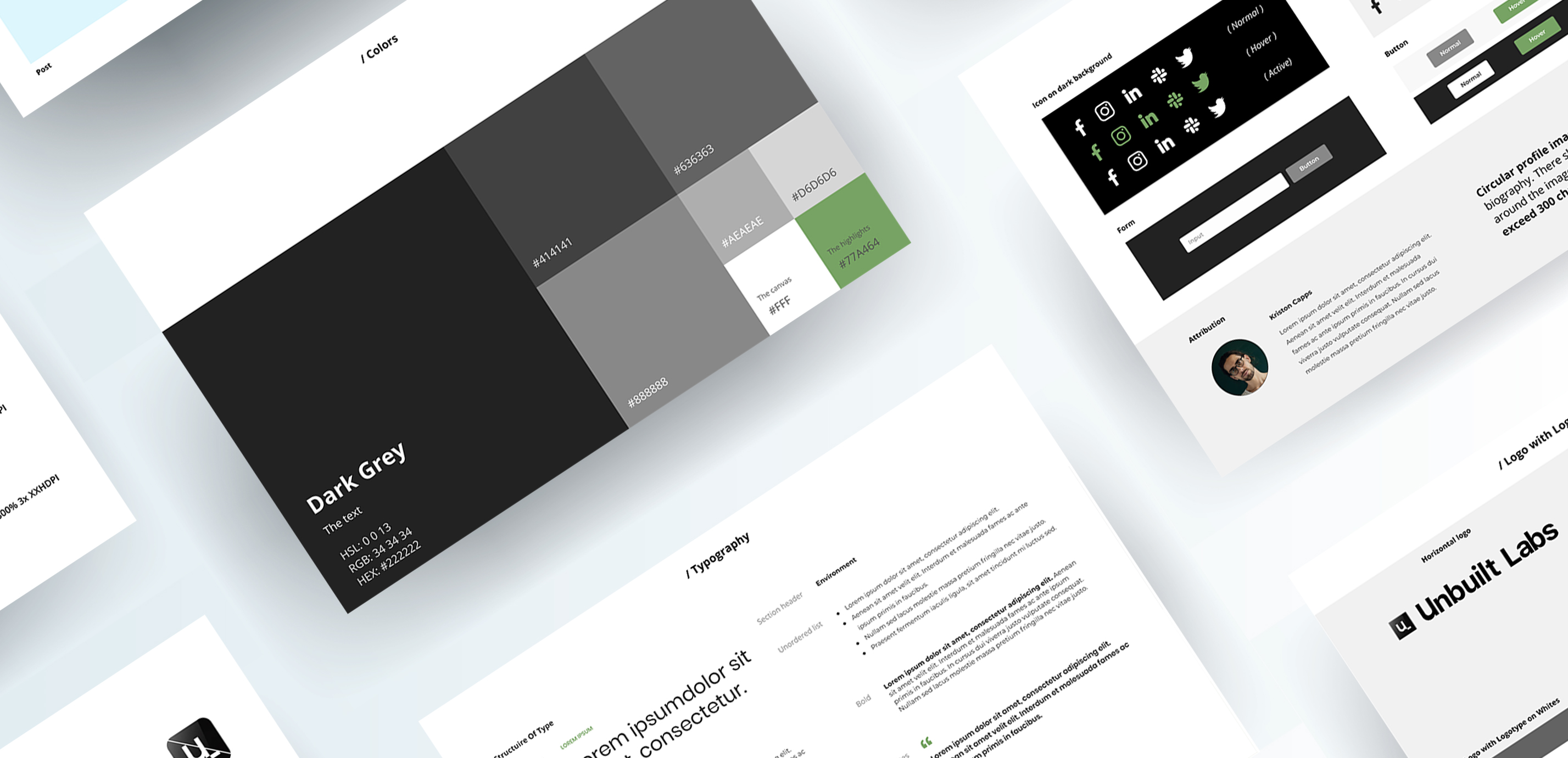
See Full Brand Guideline and a press release - Unbuilt Labs: Rebranding sustainability on Unbuilt Labs website. The brand guidelines are applied to improve the visual aesthetics of Unbuilt Labs's official website, also the cohesive final design look on the research feed page.
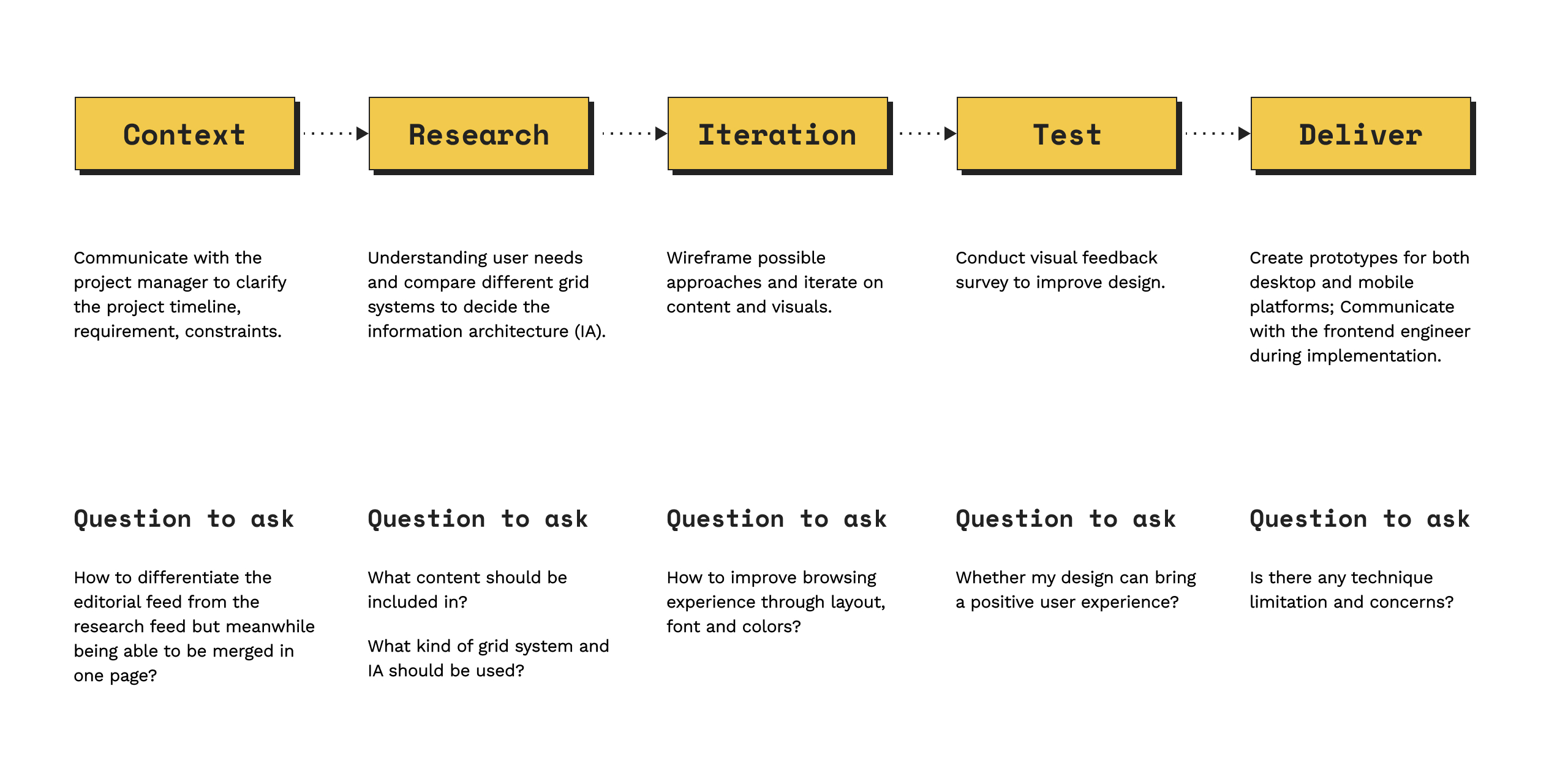
My plan is using a web-first strategy to define the information architecture
of the research feed page at first.
Using web-first approach instead of mobile-first web design because I realized that the grid system
is the key point I need to tackle with, on which web design has more challenges.
A survey was conducted by me to understand user needs for an editorial website experience. Results show that users like stylish, modern-look design and they're usually drawn attention by article title, tagline and image preview. Thus,
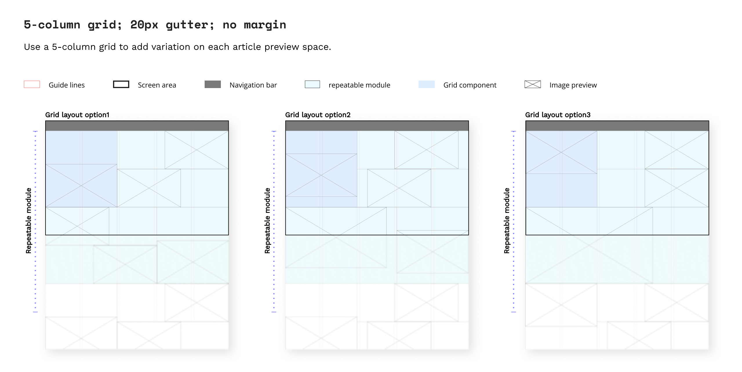
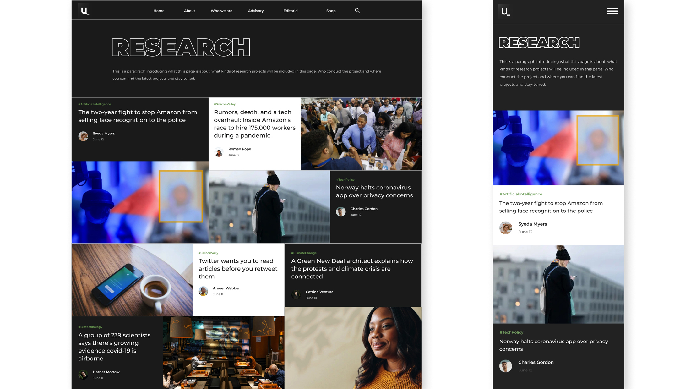
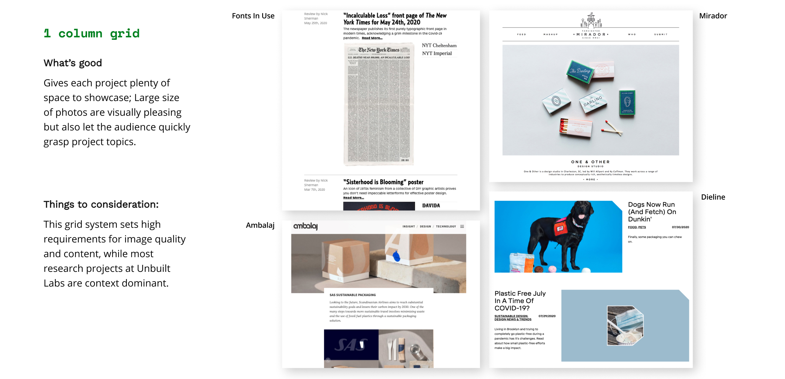
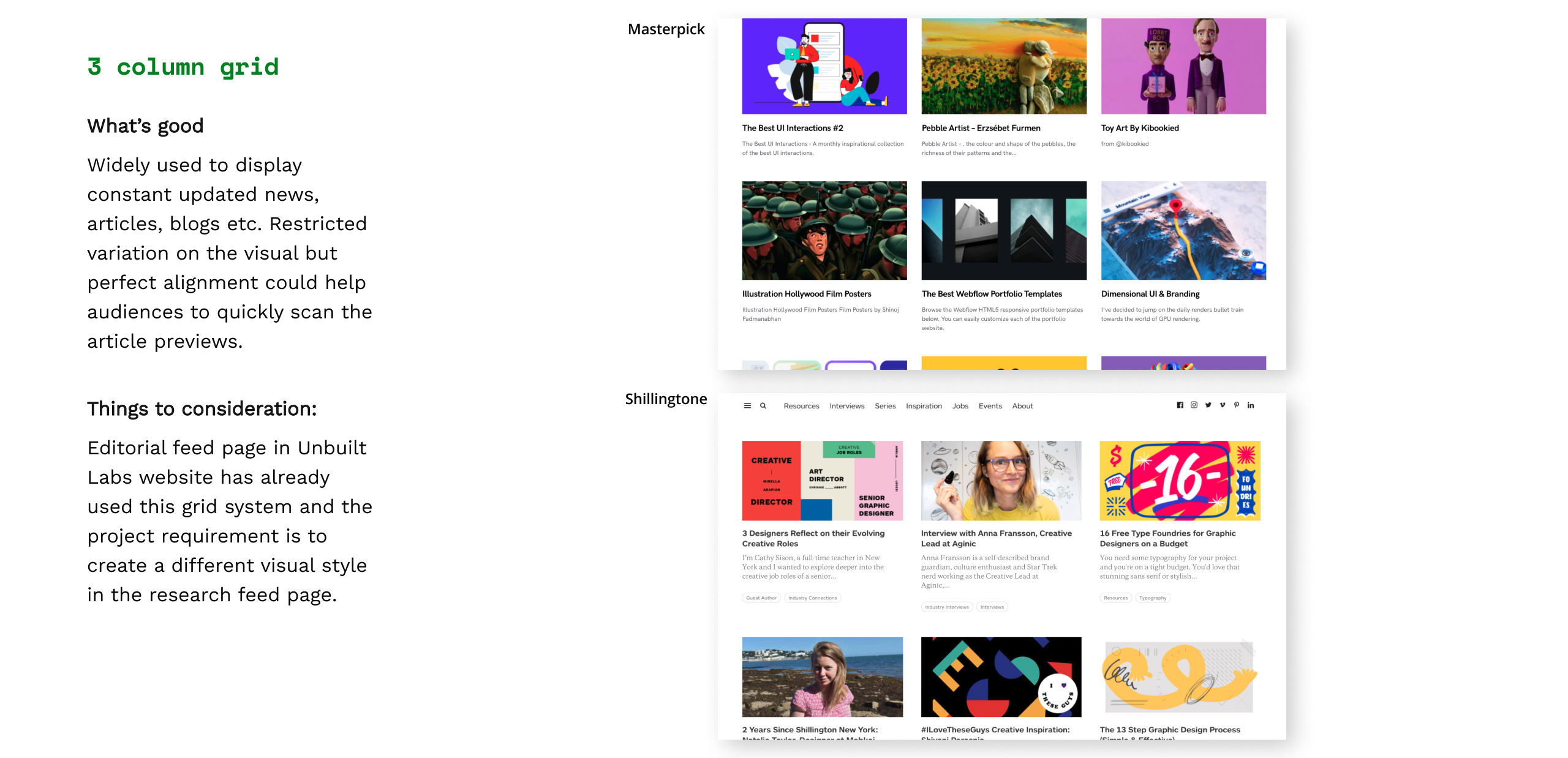
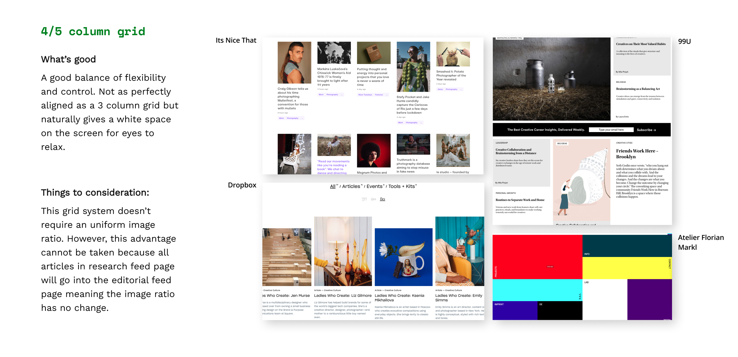
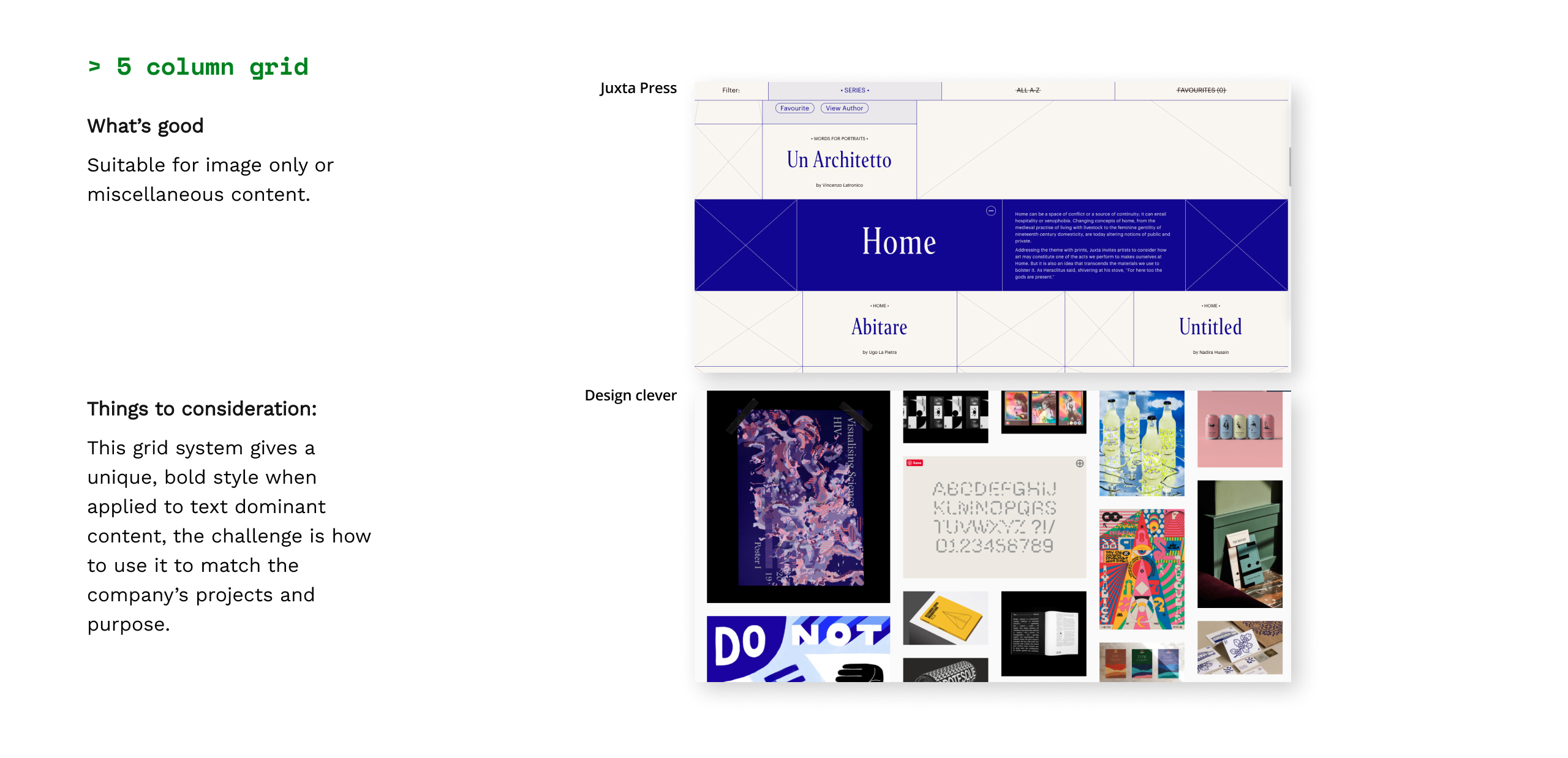
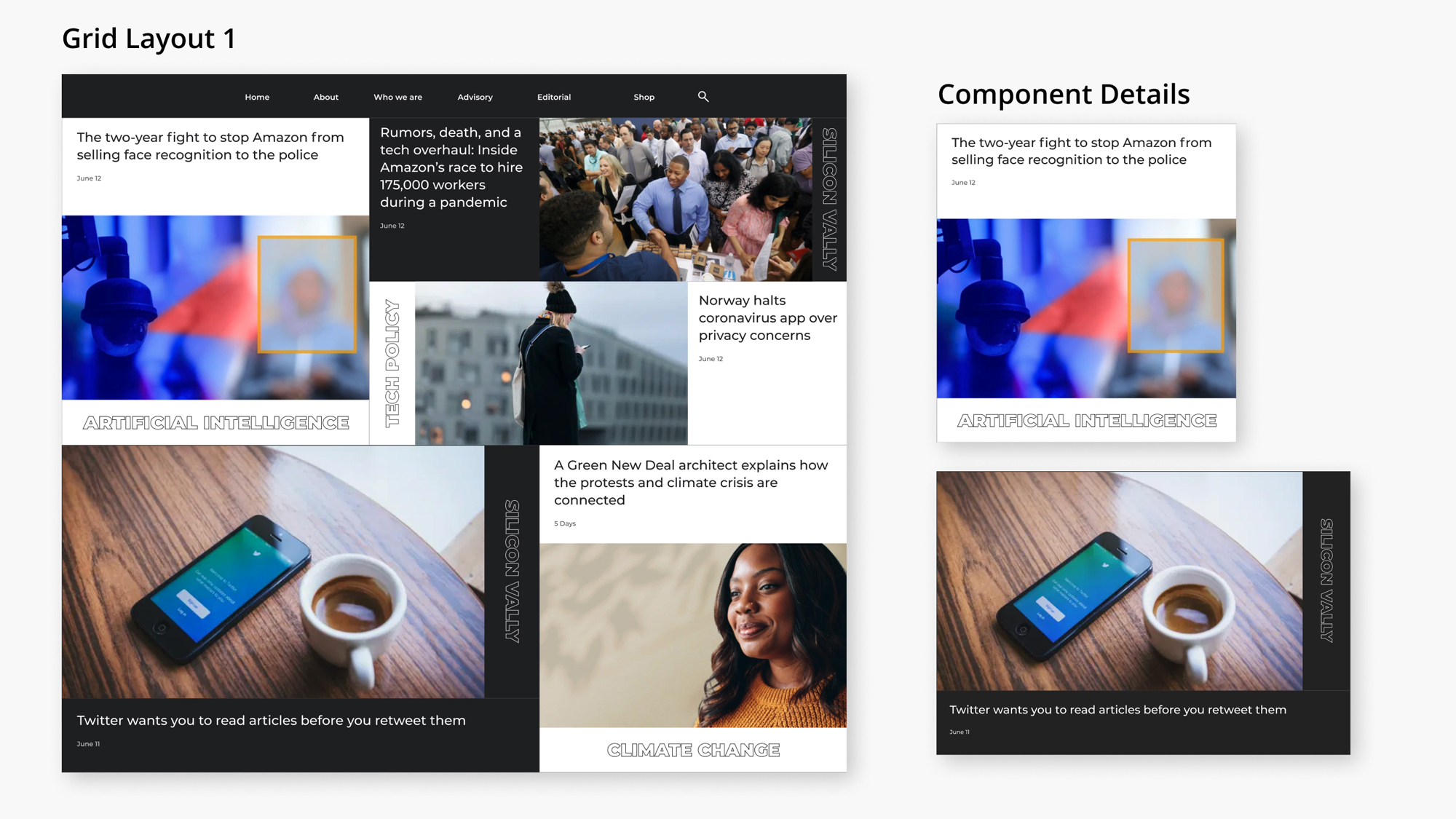
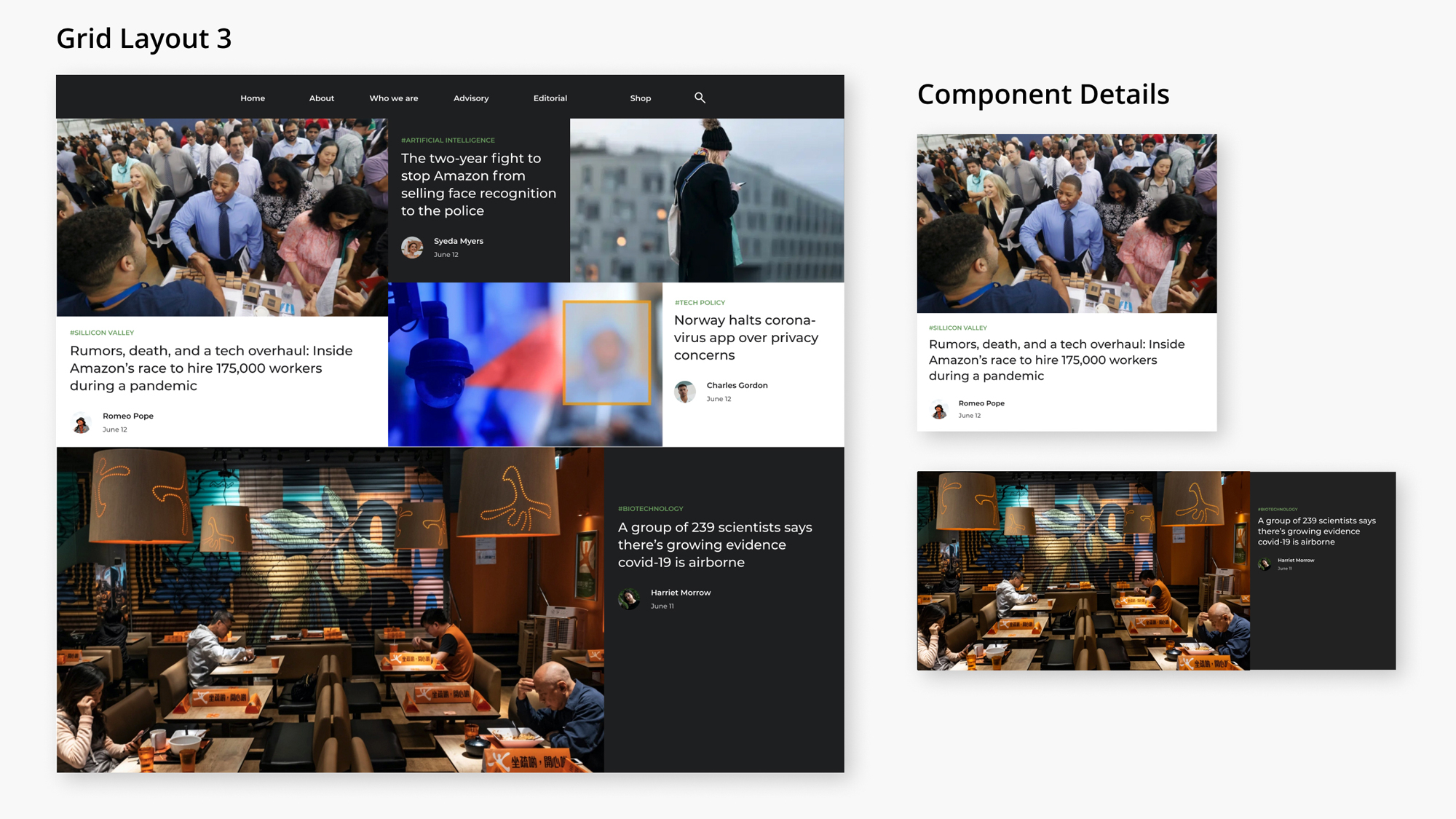
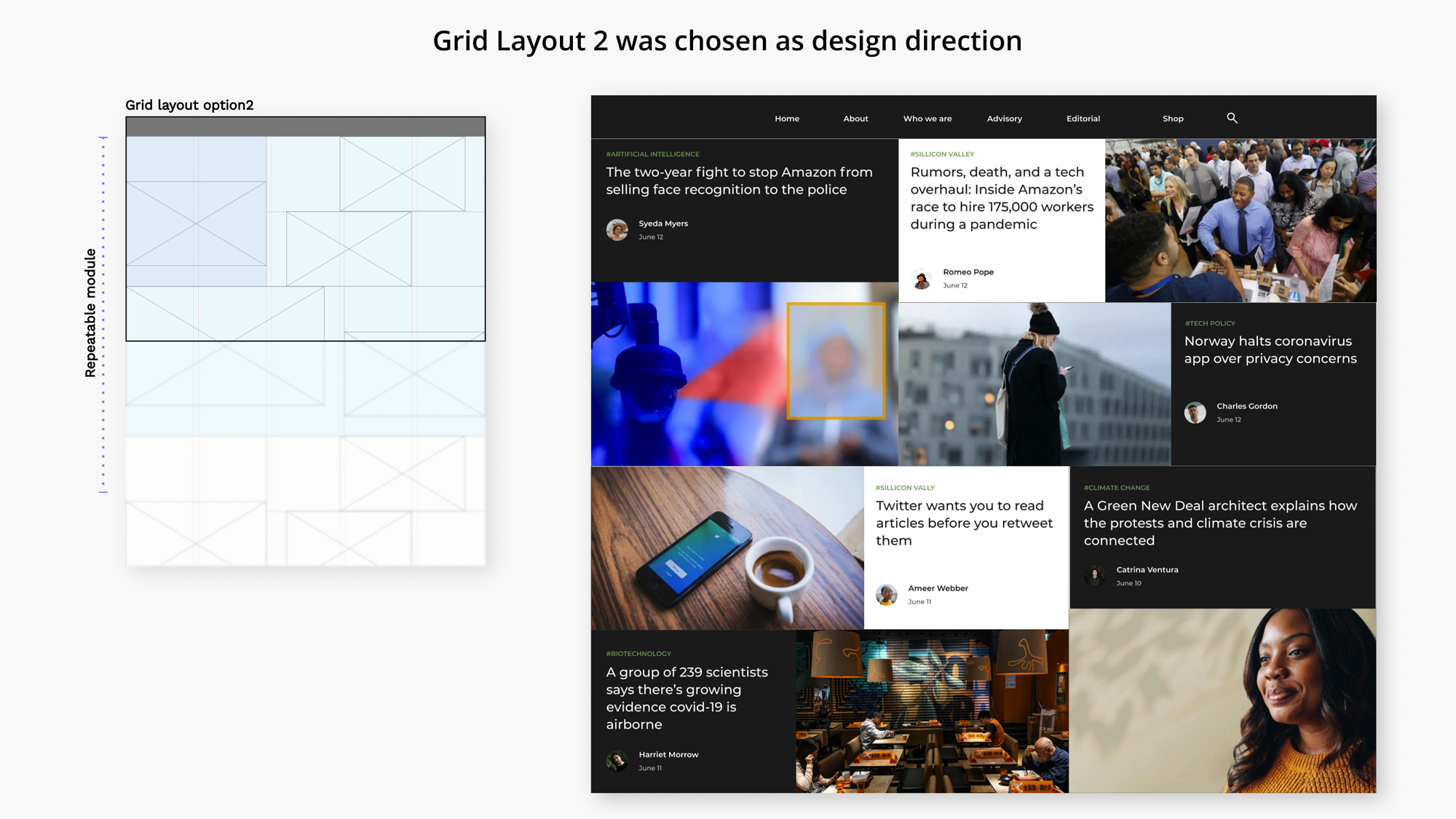
In the brand guideline, I've already create rules for brand color palettes, font choices, structure of types and photography usage. I used them as references to create wireframes (shown below) to compare 3 different approaches on grid layout I sketched above.
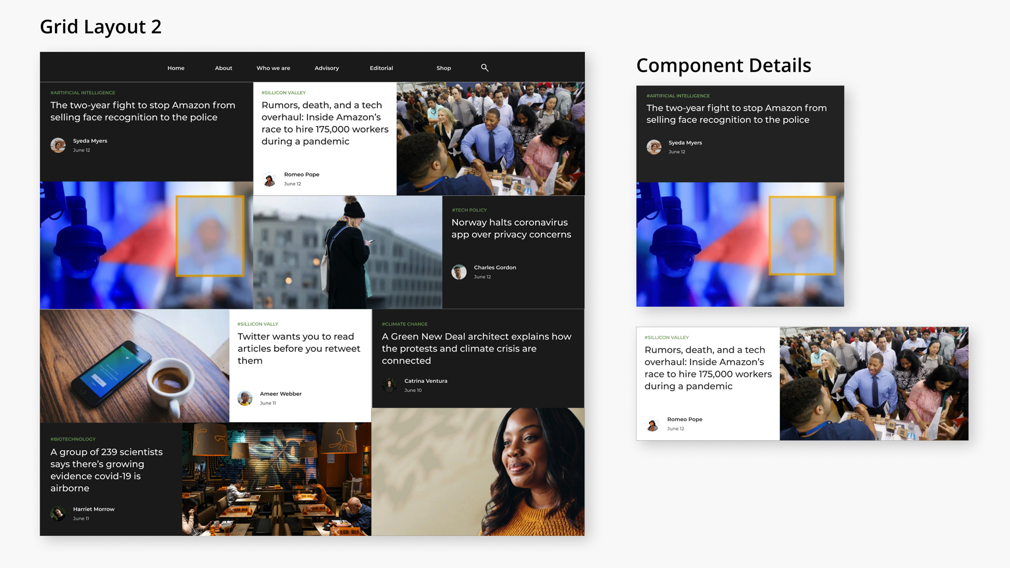
I chose to go with Grid layout 2 because:
1. Each article preview has an even screen space to gain attention from audiences;
2. Clear boarder between each grid component to decrease ambiguity.
3. A good implementation affordability.
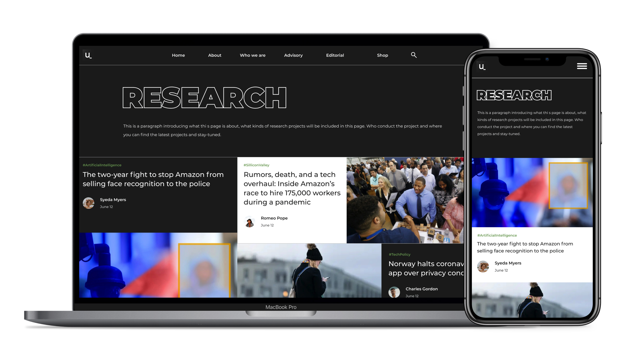
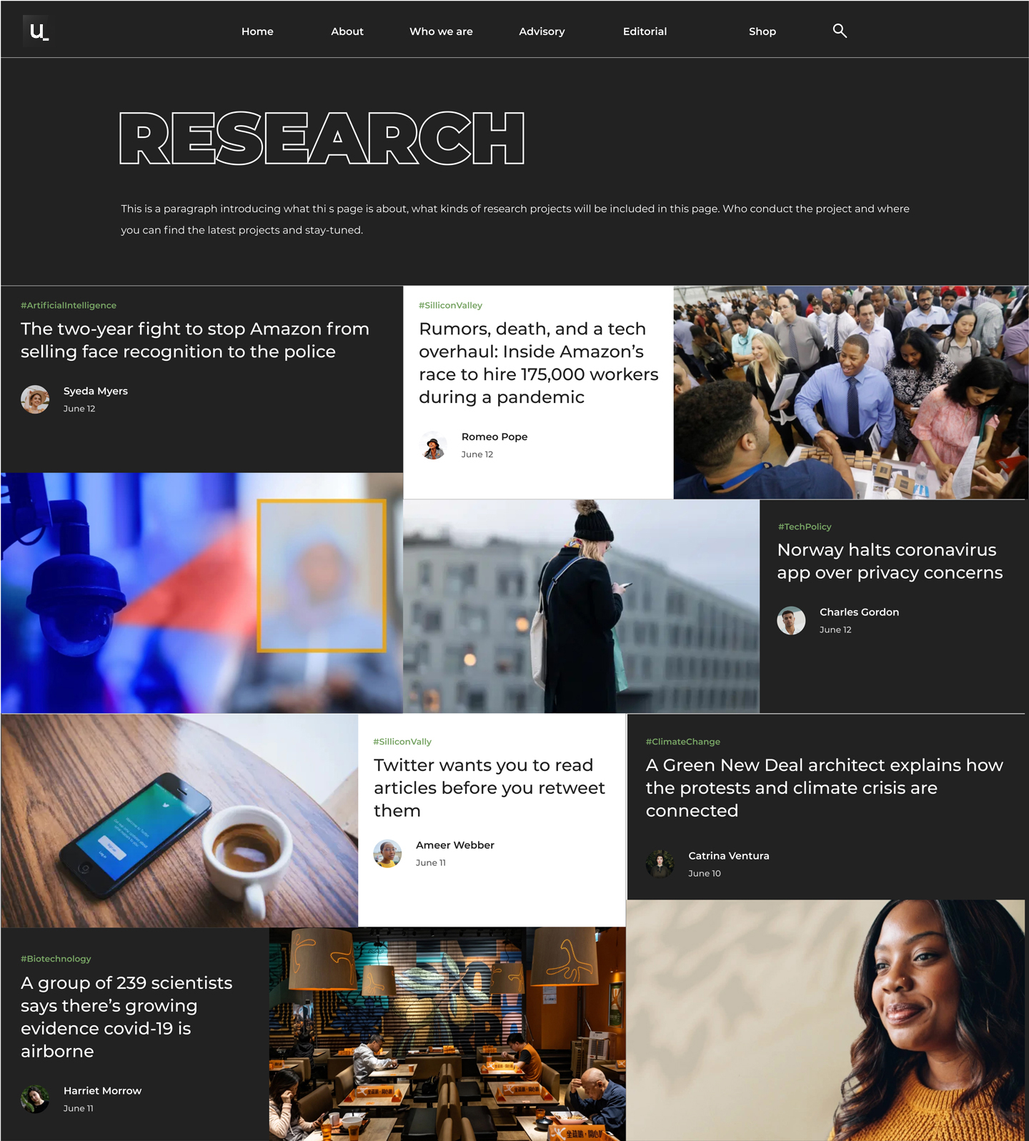
Considering it has a great chance that users enter this page through search
engines or social media, I designed a banner to make the page more self-speaking.
The outline stroked font is inherited from an uniform header style across Unbuilt
Labs website other pages.
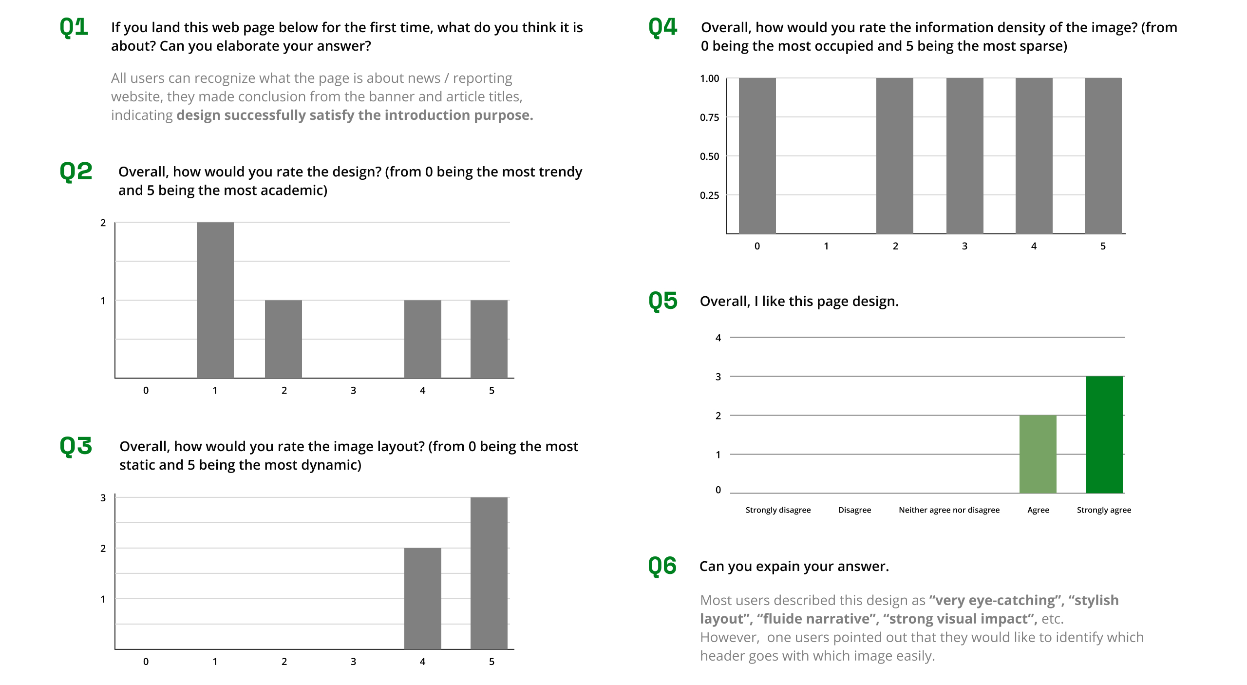
A questionnaire was used for testing users' satisfication on overall design ,
asked question including: impression on page layout, information density, visual style, etc.
Question and responses are summarized below.
As a product design intern at a startup,
I got a valuable chance to build the company's brand guidelines. I was able to take a close look at how it
helps to form my outputs as well as the company's marketing campaigns.
I was also impressed by how design constraints can fasten my work through giving me a focus to deal with.
Like in this project, while I had constraints on image ratio and visual style, it actually led me to understand that playing with grids
is the way I should go with.